of a diagnosis, the greater the threshold likelihood
ratio must be. This is somewhat unexpected because
it means that the less critical the clinician is about
excluding a certain disorder, the better the perform-
ance required of a screening test. Such a conclusion
is at odds with the intuitive notion that less serious
illnesses can be screened for casually, with studies
of mediocre quality. But, in fact, evidence from a
study of high quality is needed to convince a clini-
cian to abandon an impression of health, which is
after all the alternate hypothesis in an asymptomatic
patient, in favor of the pursuit of a disorder of little
clinical moment, especially when additional diagnos-
tic evaluation involves stress, expense, and risks to
the patient.
It is possible that some results of a screening
study possess large enough likelihood ratios that a
diagnosis can be made on the basis of these results
alone. For this to be so, the study results must have
likelihood ratios that exceed the threshold ratio for
acceptance of the diagnosis,
threshold likelihood for acceptance =
(
1
−
prevalence
)
P
[
acceptance
]
prevalence
(
1
−
P
[
acceptance
])
Differences between populations as regards the
frequency of risk or protective factors can signifi-
cantly alter the prevalence of the disorder within the
populations and, thereby, affect the value of the
threshold likelihood ratio. Hence, the composition
of the population subjected to screening is an essen-
tial consideration when calculating threshold likeli-
hoods in screening for a disorder.
SELECTING DIAGNOSTIC STUDIES
A physician conducting a diagnostic evaluation
usually has available a number of studies and study
combinations from which to choose to address
specific diagnostic questions. Which study or study
combination is the best to order? The first step in
answering the question is to decide if "best" means
that, over a broad range of possible performance
criteria, one study is superior to the alternative
studies or if "best" means that the study is the most
successful classifier within a specified criterion
range.
When one wants to compare study performance
over a wide range, the index of classification
accuracy that is used is the area under the ROC
curve. This index is appealing because it is
equivalent, in the case of a diagnostic study, to the
probability that, given two individuals, one with a
disorder and one without, the study result will be
more suggestive of the condition in the individual
who has the disorder. Obviously, the larger this
probability, the better a classifier the study is. To
compare the classification accuracy of laboratory
studies, then, one calculates the area under the
respective ROC curves and tests the differences
between the area estimates for statistical
significance. If significant differences are found, the
study with the largest area is the best classifier.
A method for calculating and comparing the
areas under ROC curves is available for data fitting
normal distributions (Wieand
et al.
1989). ROC
curves arising from lognormally distributed data can
also be analyzed by this method by log transforma-
tion of the data into its normally distributed form.
Guyatt
et al.
(1992) describe the application of this
method to the ROC curves for various markers of
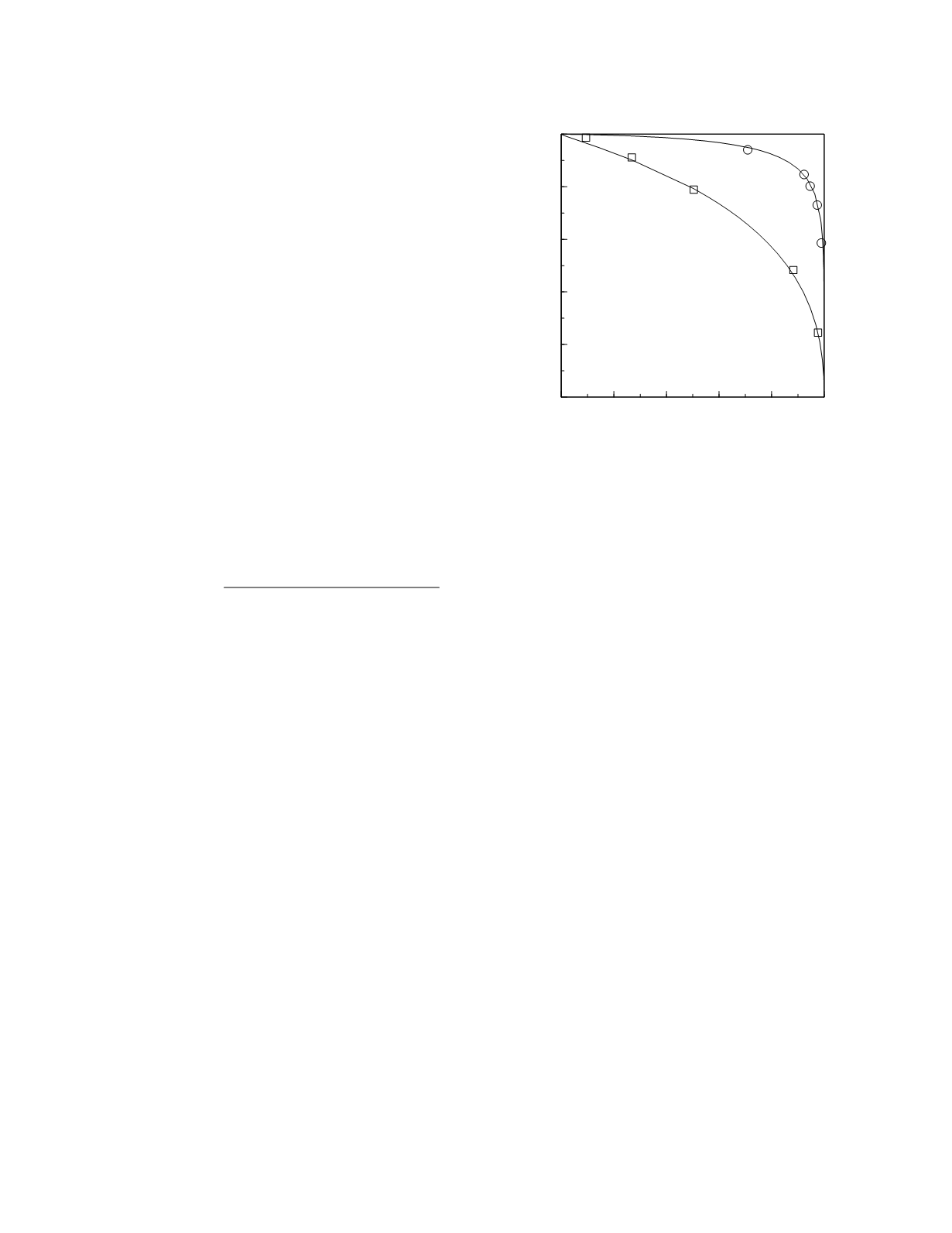
iron deficiency in adults with anemia. The empirical
curves for plasma ferritin concentration and transfer-
rin saturation from that paper and the curves arising
from lognormal frequency distribution models of the
data are shown in Figure 3.12. The area under the
ferritin ROC curve is 0.95 (95% confidence interval,
0.94 to 0.96). The area under the transferrin satura-
tion ROC curve is 0.74 (95% confidence interval,
0.70 to 0.78). The area under the ferritin curve is
Diagnostic and Prognostic Classification
3-14
0
0.2 0.4 0.6 0.8
1
Specificity
0
0.2
0.4
0.6
0.8
1
Sensitivity
transferrin
saturation
ferritin
Figure 3.12
ROC curves for ferritin and transferrin satura-
tion. The squares and circles represent the points derived
from the empirical frequency data and the continuous lines
are the curves derived from the lognormal frequency distri-
bution models of the data.


