Continuous heterogeneity
Two questions must be addressed when dealing
with continuous heterogeneity. First, it must be
decided if there is an interval over which the source
of heterogeneity influences the frequency distribution
of study values to a clinically significant degree.
The most practical way to answer this question is to
generate a scatterplot of study results from a large
number of individuals who represent as broad as
possible a range of values for the source of heteroge-
neity under consideration. The scatterplot is
inspected visually to determine if there are intervals
over which the distribution of data points appears to
vary significantly. While visual examination is often
adequate to detect a pattern in the width of a data
distribution, it can be difficult to identify trends in
the mean, especially when the data show appreciable
variability. In such cases, the scatterplot should be
sliced or nonparametric scatterplot smoothing should
be performed to reveal how the central tendency of
the data varies with respect to the source of hetero-
geneity (Jacoby 1997). Slicing a scatterplot means
separating the data into several bins defined by equal
intervals on the x axis, i.e. the axis representing the
source of heterogeneity, and computing the
frequency distributions of the data within each bin.
The mean values of each distribution are then plotted
against the mid-interval values of the bins.
Nonparametric scatterplot smoothing techniques are
elaborations of the slicing method in which numero-
us variably sized, partially overlapping bins are used
to generate a large number of local mean value
estimates which are then connected by short line
segments to yield a smooth curve.
The second question that arises when dealing
with continuous heterogeneity is how best to present
the reference frequency distribution. Two different
approaches are in common use. The first and by far
the most common approach is to present the
frequency distribution as a sliced scatterplot. The
median and central range of the data for each bin is
plotted either as a boxplot or, if the data is normally
distributed, as the mean with “error” bars. This
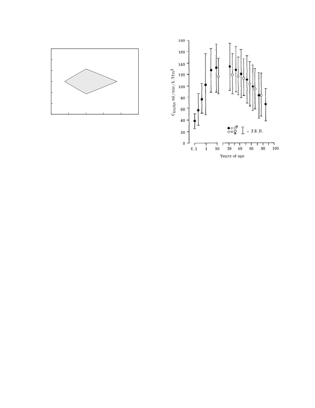
method is illustrated in Figure 6.3 which shows the
relationship between inulin clearance rate (a measure
of glomerular filtration rate) and age. In this graph,
the error bars represent plus and minus 2 standard
deviations and hence directly demonstrate the central
95 percent range of the data within each bin. The
second approach is to present the frequency distribu-
tion as smooth curves indicating the mean values of
the distribution and the upper and lower limits of the
central range of the distribution. This is done by
modeling the relationship between the frequency
distribution and the source of heterogeneity. The
curve defining the mean values of the frequency
distribution can be modeled nonparametrically using
Biologic Variability
6-3
0.5
0.75
1
1.25
1.5
1.75
SD ratio
-1.5
-1
-0.5
0
0.5
1
1.5
Scaled difference in means
separate
combine
Figure 6.2
Graphical test of the heterogeneity of reference
frequency distributions when both distributions are normal or
can both be transformed to yield normal distributions. SD
ratio is the standard deviation of subgroup 2 divided by the
standard deviation of subgroup 1. The difference in the
subgroup means is scaled by division by the standard
deviation of subgroup 1.
Figure 6.3
Inulin clearance rate as a function of age.
Mean rates and standard deviations binned irregularly until
10 years and by decade thereafter. Reprinted from
Avendano LH and Novoa JML. 1987. Glomerular filtration
and renal blood flow in the aged. In Nunez JFM and
Cameron JS (eds).
Renal Function and Disease in the
Elderly.
Butterworths, London.


